introduction
this is a basic code guide for how i made my v2 header, lofi girl (see my homepage). its main features that i will probably want to revisit in the future are:
- gif assembly
- layered clickable image elements
- mobile compatibility without fucking up the placements of each asset
- links that do not activate in the whitespace of the image
- link name/title on hover
this guide may be helpful to people other than me, but maybe only if you are a lot like me, because i’ve written this for myself so it might be not as easy to parse as an outsider. please feel free to pick and choose what might serve you. this guide assumes you have some understanding of art programs and your own way of dealing with layers – i don’t go into much detail about my drawing process.
i simplified some of my code and replaced some classes and ids for the sake of this guide, but any code that’s a note to myself for reference in specifically my code (read: even less comprehensible to others than the rest of this guide) will be marked with “NTS:” preceding it. feel free to disregard if you see it!
🖌️ making the assets
the actual drawing part
- think of a header design lol.
- consider what important pages you would like it to link to. what visual elements should be in it? how do you want it laid out?
- you can sketch it out on one layer, BUT THAT IS THE LAST TIME YOU WILL USE THE ONE LAYER.
- do the lineart for each asset on individual layers. ideally, draw them in full – not just the parts that will be seen. this prevents any woes about placement later (e.g. “oh no, the part i didn’t draw is visible when i resize it to xyz size window!”)
- i did not do this for everything though… this is just what i recommend…
- color each asset on individual layers as well. you would do well to put them in folders, although i never do <3
- at some point, you’ll realize that some layers can be merged. for example, with v2, i merged a lot of the background assets (like the chair, the table, etc) that would all end up under the same linkable images anyway. so do that if you want.
making the gif frames
this is where it gets annoying. skip this if you’re not looking to make gif assets (good for you!!!!!!!)
- duplicate each inked-and-colored asset folder (this is where the folders come in handy!) twice. at this point, you should have three identical sets of lineart and color layers (so that’s six layers total).
- i say to have 3 sets, but you can probably do more if you want more frames. i am lazy, but i also don’t like a two-layer wiggly lineart animation, so 3 is my minimum.
- redraw the lineart in two of the three sets. you can do this however you like.
- my recommendation: lower the opacity of the existing duplicated lineart layer. then make a new layer over that, trace it, and then delete the lowered-opacity layer.
- it doesn’t have to be perfect. dat’s da point
- hide the other two sets while you work in one set.
- check the color layer for each set to see if there are any blank spaces or color overlaps to fix, then fix them.
- you now have your three frames for each asset. hurrah!
GRRRR SAVING ETC
- if your program allows you to crop your images to the edge of the outermost pixel and make nice gifs right off the bat, more power to you. unfortunately, i don’t love procreate’s cropping tool and prefer to work in the more exact clip studio paint. so if you work in procreate and are me (like i assume), you would then export your working canvas to your laptop to move to CSP.
- optional: save a backup of that working file and duplicate it to work in a new one. in your new one, merge the lineart and color layers already so there’s less going on.
- if you are NOT making gifs: simply crop each asset. done! skip to “arranging the code”.
- if you are making gifs: keep reading.
gif-saving hell for freaks who like pain
- go through the painstaking process of
- hiding all other asset folders except the one you’re working with
- cropping the image to the outermost pixel of all three frames
- hiding the other two frames of your chosen asset
- and saving each frame individually (NOT in your site folder just yet).
mini-FAQ (may need to close & open a few times to load fully)
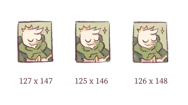
Q: what the hell do you mean by cropping to the outermost pixel of all three frames
A: so if you select only the one frame and try to compile a gif from each of those three frames saved to their individual dimensions, it’ll look stupid when animated, because they have different dimensions.
you want the canvas dimensions to be the same for all three frames by setting it to the max height and width of the three frames. so in this example, frame 1 is the widest at 127px, and frame 3 is the tallest at 148px. the resulting canvas should thus be 127x148px.
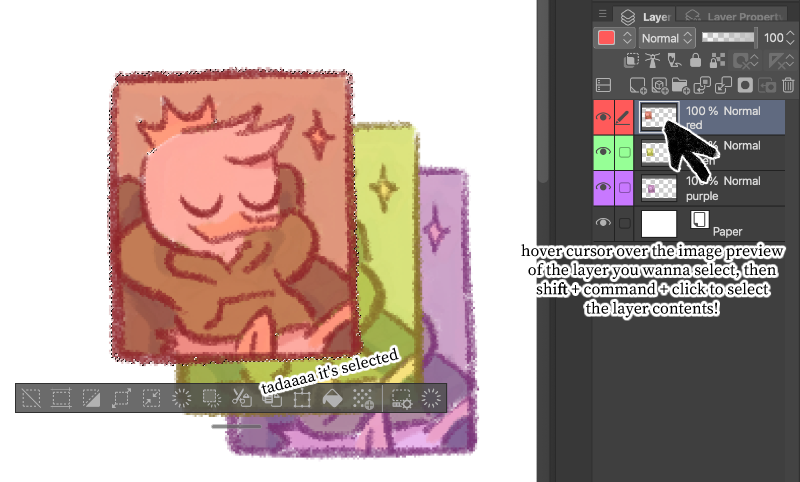
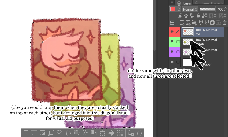
the easiest way to do this is to
shift+command+click(or i guessshift+control+clickfor windows) the image preview of each of the three three frame layers/folders. this selects the contents of each layer and combines them. thencommand+Kto crop!
your files will look something like this:
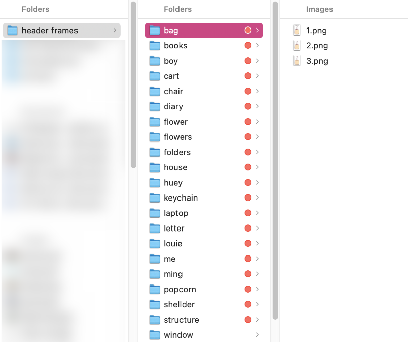
do you see this shit applejack (btw save them as transparency-compatible images, like PNG or WEBP)
- then head on over to ezgif. you can make it into a gif or an animated webp.
- i chose the latter, so i went here.
- upload your chosen asset’s three frames. once they’re up, set the delay time and quality however you like (i chose 50 delay time and 100 quality).
- make sure to check “don’t stack frames” for the reasons it says on the site!
- hit make webp.
- optional to optimize your image further, but otherwise, just save it. (now it goes in your site folder!)
💻 arranging the code
setting up
-
set up the cover container’s html and css.
- i used
id, but it doesn’t have to beid, honestly. you can useclass. - (NTS: this makes it easier to transfer over to the layout archive, btw, since they make use of
classforcoverandmainCover.)
home.html <div id="cover"> </div>home.css #cover { position: relative; /* allows you to place the assets where you like */ } - i used
-
the actual size of the cover image needs to sit inside of the
#coverso that it takes up height. for some reason i used the id#mainCover#background.- again, doesn’t need to be
id.
home.html <div id="cover"> <img src="/images/bg.jpg" id="background"> </div>home.css #mainCover { width: 100%; /* makes it not go over the designated width of my site content */ border-radius: 20px; /* i just like a round border */ } - again, doesn’t need to be
-
🔥 HOT TIP: while working on placing my assets, my current image saved as
/images/bg.jpgis a low-opacity single frame of the whole header.
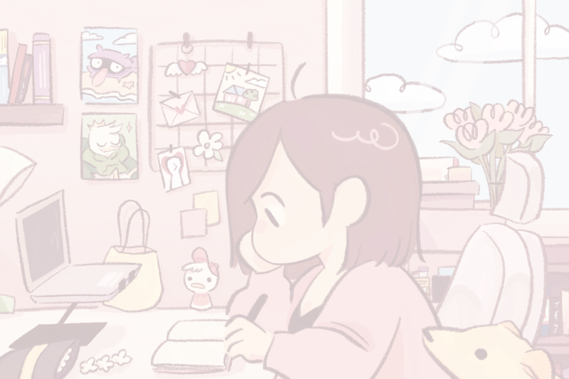
like so.
this helps me see where things are going to go.
-
after plugging in the background, make a div to contain the placeable assets. in my actual code, this section is called
.clickable.placeable.home.html <div id="cover"> <img src="/images/bg.jpg" id="background"> <div class="placeable"> </div> </div>home.css .placeable { position: absolute; top: 0; left: 0; width: 100%; height: 100%; } -
now you are ready to position your assets!
positioning assets
-
choose one asset. place it in a div inside of the
.placeablediv, and give it a unique class/id name. for this example, i’m placing my laptop asset.home.html <div id="cover"> <img src="/images/bg.jpg" id="background"> <div class="placeable"> <div class="laptop"></div> </div> </div> -
place your image inside of it.
home.html <div id="cover"> <img src="/images/bg.jpg" id="background"> <div class="placeable"> <div class="laptop"> <img src="/images/laptop.webp"> </div> </div> </div>
result: whoa! it’s huge and weird and not in the right place!
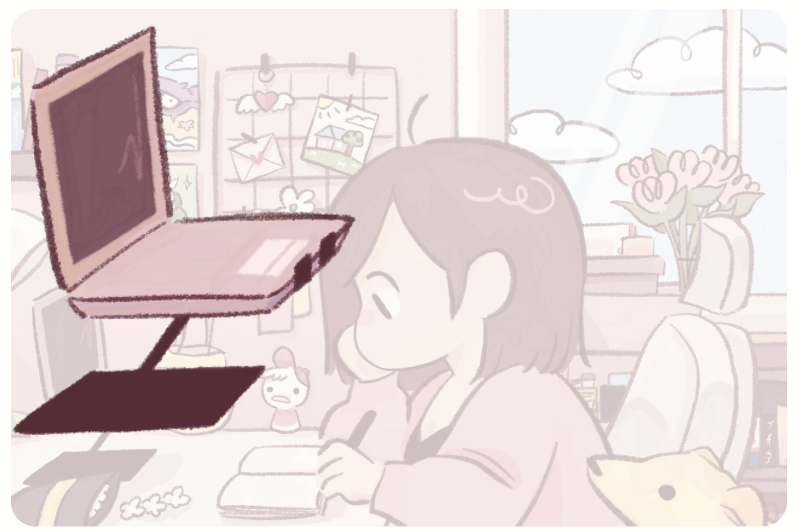 it’s time to position!
-
in your css file, set up the height and position of your chosen asset’s image.
- there is no easy way to do this. it’s a lot of eyeballing and editing + saving. using a live preview is super helpful in this case, as well as using the low opacity background to figure out where you initially wanted it to be!
- for maximum responsiveness, i work in percents.
home.css .laptop img { position: absolute; top: 47%; left: 1.5%; height: 44.5%; }
much better! now we have an image where it’s supposed to be.
-
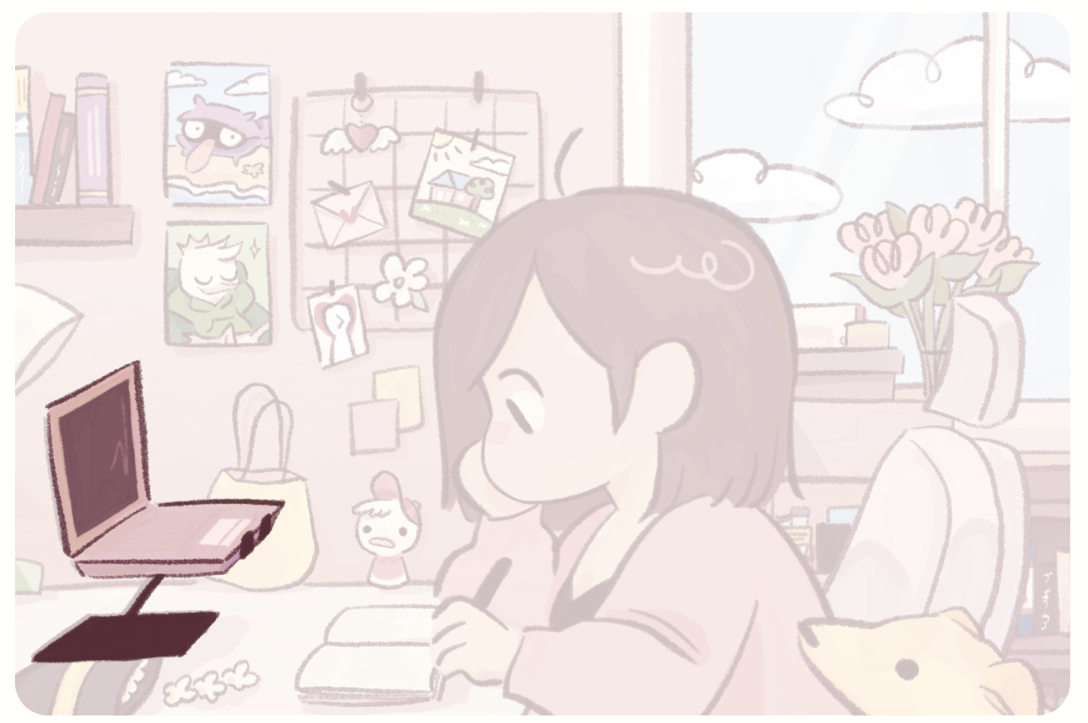
go ahead and do this with all your assets – linky and not-linky alike.
- at this point, you’ll be able to layer them as you like. things farther down in the code are farther in front.
- this is how my code ended up looking:
home.html <div class="clickable"> <div class="background"><img src="/images/bg.jpg"></div> <div class="window"><img src="/images/window.webp"></div> <div class="structure"><img src="/images/structure.webp"></div> <div class="bouquet"><img src="/images/bouquet.webp"></div> <div class="folders"><img src="/images/folders.webp"></div> <div class="cart"><img src="/images/cart.webp"></div> <div class="chair"><img src="/images/chair.webp"></div> <div class="house"><img src="/images/house.webp"></div> <div class="keychain"><img src="/images/keychain.webp"></div> <div class="letter"><img src="/images/letter.webp"></div> <div class="flower"><img src="/images/flower.webp"></div> <div class="boy"><img src="/images/boy.webp"></div> <div class="shellder"><img src="/images/shellder.webp"></div> <div class="louie"><img src="/images/louie.webp"></div> <div class="books"><img src="/images/books.webp"></div> <div class="huey"><img src="/images/huey.webp"></div> <div class="bag"><img src="/images/bag.webp"></div> <div class="laptop"><img src="/images/laptop.webp"></div> <div class="popcorn"><img src="/images/popcorn.webp"></div> <div class="diary"><img src="/images/diary.webp"></div> <div class="me"><img src="/images/me.webp"></div> <div class="worm"><img src="/images/worm.webp"></div> </div>
- in which
wormis the farthest in front (nothing covering her!) andwindowis allll the way at the back, just on top of the background.
adding links
if all your assets are squares, you could easily just wrap your img with an a and be done with it. but i have weirdly-shaped assets and want to make it such that the link only activates when the SPECIFIC ASSET I DREW is being hovered on, and NOT any transparent pixels in the rectangular canvas housing the asset i drew!
so how do we do that? with clip paths! (many thanks to aegi for demystifying this.)
-
before we get into clip paths, add the
ato your html.- i put my
abelow theimgline for now, but we’ll move it later. don’t worry about it.
- i put my
-
place a
spaninside thea. this span is going to be what holds our clip path, and this is what the link is going to activate on.home.html <div class="laptop"> <img src="/images/laptop.webp"> <a href="/site"> <span></span> </a> </div> -
ok, now we can start clipping! you will need an image URL to use clippy, so upload your asset image somewhere where you can get the link and then paste the link into clippy. for this example, i’ll be using my huey keychain, because it’s a hassle to get the laptop image…
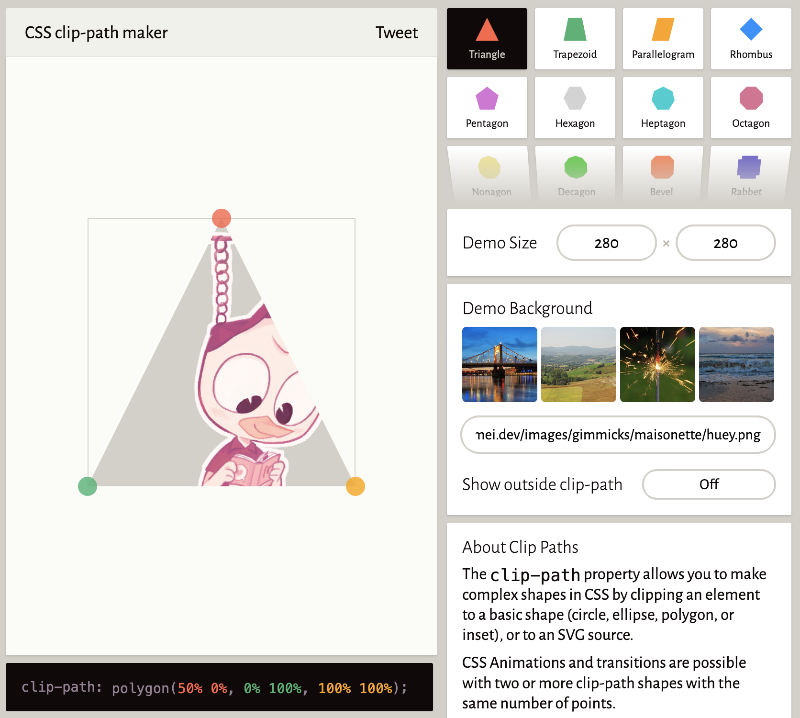
girl oh no!
- if your image is larger than 400px: get the exact dimensions of your image and use a proportion scale calculator to make it tinier. clippy won’t take anything too big is why.
- huey is 490x870, so after plugging those lengths into the calculator, i got 225.29x400.
- plug your new numbers into the “demo size” spaces on clippy, and then hit the option for “custom polygon”.
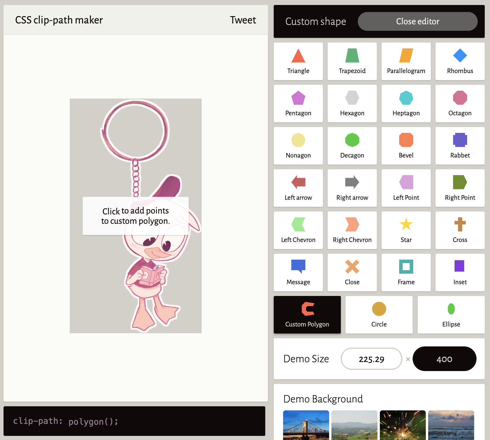
- start clicking around the area you want the link to activate on.
- 🔥 HOT TIP: toggle “show outside clip path” to “on”. this helps you see your image as you make your custom clip path.
- do not attempt to close the shape yourself when you’re done. get up to the LAST point you would make before it meets the first point you clicked, then continue reading.
- so if i only want the link to activate when huey is hovered on (and NOT the keyring or chain), then my clip path would look something like this:
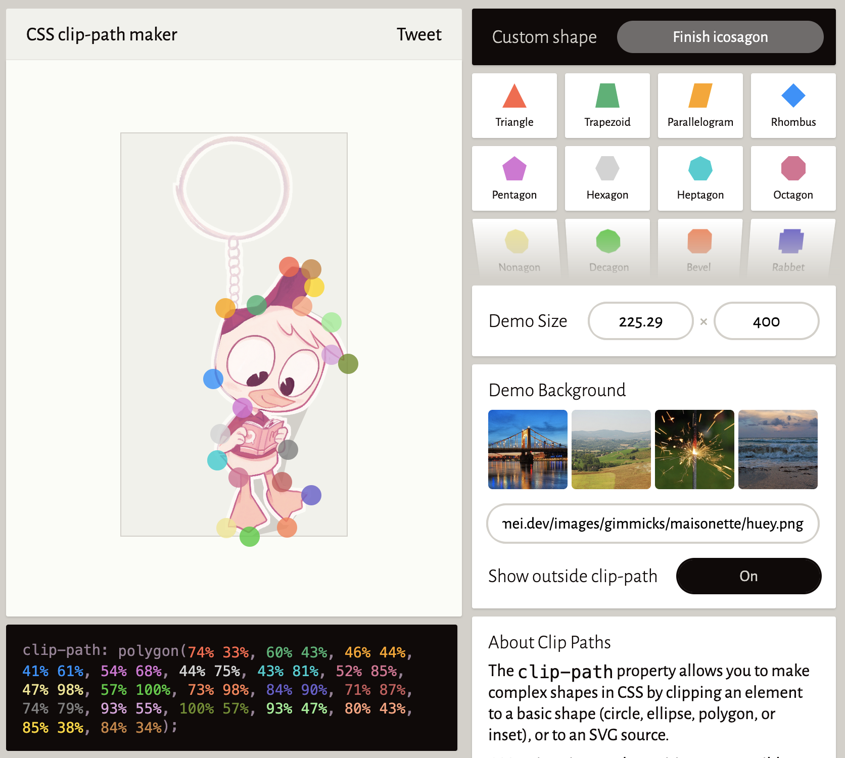
-
instead of attempting to close the shape yourself, click the “finish [whatever shape it is]” in the upper right black rectangle that says “custom shape”.
-
nice! copy the code in the black rectangle under your image and place it in your css for the
span. here’s me going back to the laptop example:home.css .laptop span { clip-path: polygon(4% 19%, 13% 67%, 21% 74%, 46% 73%, 35% 84%, 23% 85%, 0% 100%, 61% 99%, 74% 83%, 44% 83%, 54% 72%, 76% 72%, 95% 58%, 99% 48%, 47% 49%, 43% 3%); } -
your span should have the same height and position as your img. an easy way to do that is just to add it to the top of your css for the asset’s
img, like so:home.css .laptop span, .laptop img { position: absolute; top: 47%; left: 1.5%; height: 44.5%; } -
it looks like nothing’s happened right now, but that is because your span has no width. it’s in the right place – we just gotta give it some substance! add a random width number to your span.
home.css .laptop span { clip-path: polygon(4% 19%, 13% 67%, 21% 74%, 46% 73%, 35% 84%, 23% 85%, 0% 100%, 61% 99%, 74% 83%, 44% 83%, 54% 72%, 76% 72%, 95% 58%, 99% 48%, 47% 49%, 43% 3%); width: 20%; background-color: red; opacity: 0.8; }
- 🔥HOT TIP: adding
background-colorandopacityto yourspanwill help you with 1) seeing your clip path and 2) figuring out the ideal width. you can get rid of it later. - so with the above 20% width (and added color), my preview currently looks like this:
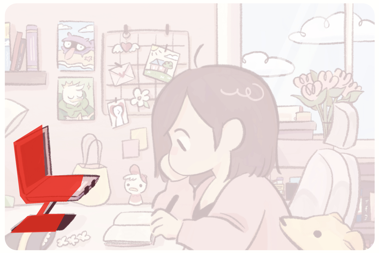
too skinny!
- gotta trial-and-error it until you reach the desired width. for this laptop asset, the ideal width is 24%.
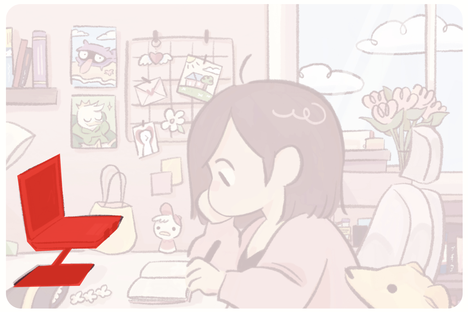
there we go!
- now you can get rid of the
background-colorandopacity. - rinse and repeat with all your assets. i’m sorry.
- final touch: replace your low-opacity background that you used for guiding asset placement with the actual background you want!
by the end of all that painstaking work, you’ll have a properly image-mapped header! wahoo! 🎂
✨ fancy stuff
hover effects
here’s what i did so hovering over each linky asset causes the image to brighten and jump up a little!
-
move the asset’s
aline above theimgline again – this means it should be “underneath” the image, visually/layer-wise.- reason: in the css, we have to be able to have an effect on the
imgwhen the clip-path (which is thespaninside of thealink) is hovered on (soa:hover + img). it doesn’t work the other way around.- it also doesn’t work if you do
.laptop:hover, mind you. if you had the image brighten when hovering over thelaptopclass, it’d do that even if you hovered over a transparent pixel in the image. WHICH IS NOT WHAT YOU WANT!!! you would have clip-pathed for NOTHING!!!
- it also doesn’t work if you do
home.html <div class="laptop"> <a href="/site"> <span></span> </a> <img src="/images/laptop.webp"> <!-- img is now the last thing before the div endtag! --> </div> - reason: in the css, we have to be able to have an effect on the
-
add the css. i am tired
home.css .placeable img { transition: 0.3s; pointer-events: none; } .placeable a:hover + img { filter: brightness(1.05); transform: translateY(-1px); }
in which:
transitionunder the img (and not thea:hover + img): ensures that it’s smooth going in and out of the state it’s in when hovered (vs. just going into the hover)pointer-events: none: you need to be able to hover over thea, not theimg. this disables the image from blocking where you would be able to click on the link.filterandtransform: the aforementioned brightening and jumping :) customize as you like.
link title on hover
-
basic level: add
title=""to youra.home.html <div class="laptop"> <a href="/site" title="about the site"> <span></span> </a> <img src="/images/laptop.webp"> </div> -
annoying level: here’s my tooltip code. i got this from a now-defunct site… please don’t ask me how anything works… i’ve marked which ones i know for sure to be customizable.
home.html <!-- place at the top of your html code. or in your css. i usually keep it in my html near the below div and script because i forget about it otherwise... --> <style type="text/css"> #dhtmltooltip { position: absolute; max-width: 150px; border-radius: 5px; /* customizable */ line-height: 120%; /* customizable */ padding: 5px 8px; /* customizable */ font-size: 1em; /* customizable */ color: white; /* customizable */ background-color: var(--whatever); /* customizable */ border: 1px dashed var(--yeah); /* customizable */ outline: 2px solid var(--woohoo); /* customizable */ text-align: center; /* customizable */ visibility: hidden; z-index: 100; } </style> <!-- originally from http://www.dynamicdrive.com/ --> <div id="dhtmltooltip"></div> <script type="text/javascript"> var offsetxpoint=-60 //Customize x offset of tooltip var offsetypoint=20 //Customize y offset of tooltip var ie=document.all var ns6=document.getElementById && !document.all var enabletip=false if (ie||ns6) var tipobj=document.all? document.all["dhtmltooltip"] : document.getElementById? document.getElementById("dhtmltooltip") : "" document.body.appendChild(tipobj) function ietruebody(){ return (document.compatMode && document.compatMode!="BackCompat")? document.documentElement : document.body } function ddrivetip(thetext, thecolor, thewidth){ if (ns6||ie){ if (typeof thewidth!="undefined") tipobj.style.width=thewidth+"px" if (typeof thecolor!="undefined" && thecolor!="") tipobj.style.backgroundColor=thecolor tipobj.innerHTML=thetext enabletip=true return false } } function positiontip(e){ if (enabletip){ var curX=(ns6)?e.pageX : event.clientX+ietruebody().scrollLeft; var curY=(ns6)?e.pageY : event.clientY+ietruebody().scrollTop; //Find out how close the mouse is to the corner of the window var rightedge=ie&&!window.opera? ietruebody().clientWidth-event.clientX-offsetxpoint : window.innerWidth-e.clientX-offsetxpoint-20 var bottomedge=ie&&!window.opera? ietruebody().clientHeight-event.clientY-offsetypoint : window.innerHeight-e.clientY-offsetypoint-20 var leftedge=(offsetxpoint<0)? offsetxpoint*(-1) : -1000 //if the horizontal distance isn't enough to accomodate the width of the context menu if (rightedge<tipobj.offsetWidth) //move the horizontal position of the menu to the left by it's width tipobj.style.left=ie? ietruebody().scrollLeft+event.clientX-tipobj.offsetWidth+"px" : window.pageXOffset+e.clientX-tipobj.offsetWidth+"px" else if (curX<leftedge) tipobj.style.left="5px" else //position the horizontal position of the menu where the mouse is positioned tipobj.style.left=curX+offsetxpoint+"px" //same concept with the vertical position if (bottomedge<tipobj.offsetHeight) tipobj.style.top=ie? ietruebody().scrollTop+event.clientY-tipobj.offsetHeight-offsetypoint+"px" : window.pageYOffset+e.clientY-tipobj.offsetHeight-offsetypoint+"px" else tipobj.style.top=curY+offsetypoint+"px" tipobj.style.visibility="visible" } } function hideddrivetip(){ if (ns6||ie){ enabletip=false tipobj.style.visibility="hidden" tipobj.style.left="-1000px" tipobj.style.backgroundColor='' tipobj.style.width='' } } document.onmousemove=positiontip </script>
then add this to the inside of any <span> you want to label.
onMouseover="ddrivetip('whatever title you want')" onMouseout="hideddrivetip()"-
combine: an asset would then look this!
home.html <div class="laptop"> <a href="/site" title="about the site"><span onMouseover="ddrivetip('about the site')" onMouseout="hideddrivetip()"></span></a> <img src="/images/laptop.webp"> </div>
yippee!
👐 just gimme the code mei
ok jesus christ
<!-- NTS: actually in mainHome.njk -->
<div id="cover">
<!-- tooltip bs -->
<style type="text/css">
#dhtmltooltip {
position: absolute;
max-width: 150px;
border-radius: 5px;
line-height: 120%;
padding: 5px 8px;
font-size: 1em;
color: white;
background-color: var(--dark);
border: 1px dashed var(--pink);
outline: 2px solid var(--dark);
text-align: center;
visibility: hidden;
z-index: 100;
}
</style>
<div id="dhtmltooltip"></div>
<script type="text/javascript">
var offsetxpoint=-60 //Customize x offset of tooltip
var offsetypoint=20 //Customize y offset of tooltip
var ie=document.all
var ns6=document.getElementById && !document.all
var enabletip=false
if (ie||ns6)
var tipobj=document.all? document.all["dhtmltooltip"] : document.getElementById? document.getElementById("dhtmltooltip") : ""
document.body.appendChild(tipobj)
function ietruebody(){
return (document.compatMode && document.compatMode!="BackCompat")? document.documentElement : document.body
}
function ddrivetip(thetext, thecolor, thewidth){
if (ns6||ie){
if (typeof thewidth!="undefined") tipobj.style.width=thewidth+"px"
if (typeof thecolor!="undefined" && thecolor!="") tipobj.style.backgroundColor=thecolor
tipobj.innerHTML=thetext
enabletip=true
return false
}
}
function positiontip(e){
if (enabletip){
var curX=(ns6)?e.pageX : event.clientX+ietruebody().scrollLeft;
var curY=(ns6)?e.pageY : event.clientY+ietruebody().scrollTop;
//Find out how close the mouse is to the corner of the window
var rightedge=ie&&!window.opera? ietruebody().clientWidth-event.clientX-offsetxpoint : window.innerWidth-e.clientX-offsetxpoint-20
var bottomedge=ie&&!window.opera? ietruebody().clientHeight-event.clientY-offsetypoint : window.innerHeight-e.clientY-offsetypoint-20
var leftedge=(offsetxpoint<0)? offsetxpoint*(-1) : -1000
//if the horizontal distance isn't enough to accomodate the width of the context menu
if (rightedge<tipobj.offsetWidth)
//move the horizontal position of the menu to the left by it's width
tipobj.style.left=ie? ietruebody().scrollLeft+event.clientX-tipobj.offsetWidth+"px" : window.pageXOffset+e.clientX-tipobj.offsetWidth+"px"
else if (curX<leftedge)
tipobj.style.left="5px"
else
//position the horizontal position of the menu where the mouse is positioned
tipobj.style.left=curX+offsetxpoint+"px"
//same concept with the vertical position
if (bottomedge<tipobj.offsetHeight)
tipobj.style.top=ie? ietruebody().scrollTop+event.clientY-tipobj.offsetHeight-offsetypoint+"px" : window.pageYOffset+e.clientY-tipobj.offsetHeight-offsetypoint+"px"
else
tipobj.style.top=curY+offsetypoint+"px"
tipobj.style.visibility="visible"
}
}
function hideddrivetip(){
if (ns6||ie){
enabletip=false
tipobj.style.visibility="hidden"
tipobj.style.left="-1000px"
tipobj.style.backgroundColor=''
tipobj.style.width=''
}
}
document.onmousemove=positiontip
</script>
<!-- tooltip end -->
<img src="/" id="background">
<div class="placeable">
<div class="asset-link">
<a href="/" title="link title"><span onMouseover="ddrivetip('link title')" onMouseout="hideddrivetip()"></span></a>
<img src="/">
</div>
<div class="asset-notlink">
<img src="/">
</div>
</div>
</div> /** NTS: actually in main in my files **/
#cover {
margin-bottom: 1em;
position: relative;
}
#background { /* NTS: #mainCover in my code */
width: 100%;
border-radius: 20px;
}
/** NTS: yes, this really goes in home **/
.placeable { /* NTS: .clickable in my code */
position: absolute;
top: 0;
left: 0;
width: 100%;
height: 100%;
}
.placeable img {
	transition: 0.3s;
	pointer-events: none;
}

.placeable a:hover + img {
	filter: brightness(1.05);
	transform: translateY(-1px);
}
/** linked asset **/
.asset-link span,
.asset-link img {
position: absolute;
top: 0%; /* replace */
left: 56.75%; /* replace */
height: 62.75%; /* replace */
}
.asset-link span {
clip-path: polygon(17% 0%, 17% 88%, 100% 88%, 100% 0%); /* replace */
width: 41%; /* replace */
}
/** static asset **/
.asset-notlink img {
position: absolute;
top: 0; /* replace */
left: 0; /* replace */
height: 99%; /* replace */
}